
This third and final part of the project follows the EDA part, and intends to dig deeper into the findings made in that EDA. In the first section, we build our statistical model, which includes defining the model, assessing its goodness of fit with various methods, and eventually refining the model; and in the second section, the final model is validated in order to have a better picture of its predictive power on new data.
# imports
library(stargazer)
library(rpart)
library(rpart.plot)
library(randomForest)
library(gbm)
library(ROCR)
library(plyr)
library(ggplot2)
library(car)
library(emmeans)
library(arm)
library(gridExtra)
dir <- strsplit(getwd(), split="jupyter")[[1]]
dirData  <- paste0(dir, "data/")
dirPlot <- paste0(dir, "plots/")
dirProg <- paste0(dir, "jupyter/")
dsSwim <- read.csv2(file = paste0(dirData, "r_swim_data.csv"), sep = ",", stringsAsFactors = FALSE)
str(dsSwim)
paste("Checking for missing values:", sum(colSums(is.na(dsSwim))))
'data.frame':	780 obs. of  10 variables:
 $ X          : int  0 1 2 3 4 5 6 7 8 9 ...
 $ swimmerId  : int  1 1 1 1 1 3 3 5 6 6 ...
 $ majorMeet  : chr  "fukuoka_2023" "tokyo_2021" "gwangju_2019" "gwangju_2019" ...
 $ meetYear   : int  2023 2021 2019 2019 2016 2023 2023 2023 2023 2022 ...
 $ event      : chr  "100m Freestyle" "100m Freestyle" "100m Freestyle" "200m Freestyle" ...
 $ relayEvent : chr  "Men, 4 x 100m Freestyle, Final" "Men, 4 x 100m Freestyle, Final" "Men, 4 x 100m Medley, Final" "Men, 4 x 200m Freestyle, Final" ...
 $ fasterRelay: int  1 1 0 1 1 1 0 0 1 0 ...
 $ gender     : int  1 1 1 1 1 1 1 1 1 1 ...
 $ country    : chr  "Australia" "Australia" "Australia" "Australia" ...
 $ ageAtMeet  : int  25 23 21 21 18 21 21 20 19 18 ...
This data set has the most relevant columns of merged_df from the EDA part, and 780 rows since the rows corresponding to athletes from the countries with the smallest numbers of observations were excluded (cf EDA).
Section 1: Building the model
Some techniques such as random forests cannot handle character information, so character variables need to be converted to type factor. For our model, the explanatory variables we are particularly interested in are meetYear, event, gender, ageAtMeet and country. However, country is a character variable that has a lot of possible values, which will yield many predictors and make our model too complex:
length(unique(dsSwim$country))
There are 25 unique country names in the country column, which if converted to a factor variable as it is, will give 25 levels. With the four other explanatory variables, our model will have well over 30 predictors, which sounds like a lot given our sample size of only 780 observations. This might lead to overfitting, or just simply make the results of our statistical analysis difficult to interpret. One way we could try to address this problem is replacing country in our model with another factor variable with a much smaller number of levels. In the previous EDA part, we interpreted the number of observations by country as an indicator of the strength of that country’s swimming tradition. Let’s have a look at the number of observations per country:
sort(table(dsSwim$country), decreasing=TRUE)
United States     Australia         China Great Britain        Russia
          121            96            71            64            56
       Canada         Italy         Japan        Brazil        France
           54            52            42            36            28
       Sweden       Germany   Netherlands       Denmark       Hungary
           28            23            22            13            12
       Poland         Korea  South Africa        Serbia   Switzerland
           11            10             8             6             6
      Belgium       Belarus     Hong Kong     Lithuania   New Zealand
            5             4             4             4             4
As a reminder, each observation (row) originally contained the best individual event time and the best relay split time for the same event in a certain meet. The more observations a country has, the more athletes from that country swam both individual and relay events which is a good indicator of the strength of a national swimming tradition. Given the number of countries and of observations, we could think of giving that new variable 3 levels: limited swimming tradition, moderate swimming tradition and strong swimming tradition. When it comes to allocating countries to these three categories, we are going to take into account the position of each country compared to the median and quartiles of the distribution, as well as the actual number of observations:
countries.obs <- table(dsSwim$country)
paste("Median:", median(countries.obs))
quantile(countries.obs, probs=c(0,0.25,0.75,1))
  0%  25%  75% 100%
   4    6   52  121
Countries with 4 to 13 observations will belong to the limited tradition category, those with 22 to 42 observations to the moderate tradition category, and those with 52 and more observations to the strong tradition category.
countries.tradition <- list()
for (i in 1:nrow(countries.obs)) {
    level <- ifelse(countries.obs[i] >= 52, 3,
           ifelse(42 >= countries.obs[i] && countries.obs[i] >= 22, 2,
                  ifelse(countries.obs[i] < 22, 1, NULL)))
    countries.tradition[[names(countries.obs)[i]]] <- level
}
swimTradition <- c()
for (row in 1:nrow(dsSwim)) {
    swimTradition <- append(swimTradition, countries.tradition[[dsSwim[row, "country"]]][[1]])
}
swimTradition <- as.factor(swimTradition)
dsSwim["swimTradition"] <- swimTradition
head(dsSwim)
tail(dsSwim)
| X | swimmerId | majorMeet | meetYear | event | relayEvent | fasterRelay | gender | country | ageAtMeet | swimTradition | |
|---|---|---|---|---|---|---|---|---|---|---|---|
| <int> | <int> | <chr> | <int> | <chr> | <chr> | <int> | <int> | <chr> | <int> | <fct> | |
| 1 | 0 | 1 | fukuoka_2023 | 2023 | 100m Freestyle | Men, 4 x 100m Freestyle, Final | 1 | 1 | Australia | 25 | 3 |
| 2 | 1 | 1 | tokyo_2021 | 2021 | 100m Freestyle | Men, 4 x 100m Freestyle, Final | 1 | 1 | Australia | 23 | 3 |
| 3 | 2 | 1 | gwangju_2019 | 2019 | 100m Freestyle | Men, 4 x 100m Medley, Final | 0 | 1 | Australia | 21 | 3 |
| 4 | 3 | 1 | gwangju_2019 | 2019 | 200m Freestyle | Men, 4 x 200m Freestyle, Final | 1 | 1 | Australia | 21 | 3 |
| 5 | 4 | 1 | rio_2016 | 2016 | 100m Freestyle | Men, 4 x 100m Medley, Final | 1 | 1 | Australia | 18 | 3 |
| 6 | 5 | 3 | fukuoka_2023 | 2023 | 100m Freestyle | Men, 4 x 100m Freestyle, Prelim | 1 | 1 | Great Britain | 21 | 3 |
| X | swimmerId | majorMeet | meetYear | event | relayEvent | fasterRelay | gender | country | ageAtMeet | swimTradition | |
|---|---|---|---|---|---|---|---|---|---|---|---|
| <int> | <int> | <chr> | <int> | <chr> | <chr> | <int> | <int> | <chr> | <int> | <fct> | |
| 775 | 797 | 456 | kazan_2015 | 2015 | 100m Butterfly | Women, 4 x 100m Medley, Prelim | 1 | 2 | Japan | 25 | 2 |
| 776 | 798 | 500 | kazan_2015 | 2015 | 200m Freestyle | Women, 4 x 200m Freestyle, Final | 0 | 2 | Great Britain | 20 | 3 |
| 777 | 799 | 501 | kazan_2015 | 2015 | 200m Freestyle | Women, 4 x 200m Freestyle, Final | 1 | 2 | China | 24 | 3 |
| 778 | 800 | 502 | kazan_2015 | 2015 | 200m Freestyle | Women, 4 x 200m Freestyle, Prelim | 0 | 2 | Russia | 23 | 3 |
| 779 | 801 | 461 | kazan_2015 | 2015 | 100m Backstroke | Women, 4 x 100m Medley, Final | 1 | 2 | Canada | 24 | 3 |
| 780 | 803 | 505 | kazan_2015 | 2015 | 100m Backstroke | Women, 4 x 100m Medley, Prelim | 1 | 2 | Poland | 23 | 1 |
Now, what is left is to convert the other character variables to factor variables as well. But before we do so, there is another variable we need to transform if we want it to have any significant predictive power. Indeed, if we try to apply our model to the athlete prospects for the 2024 Paris Olympics or next year to the swimmers who will take part in the 2025 Worlds in Singapore, the majorMeet values for each future predicted observation will be new values (say, paris_2024 and singapore_2025), so it does not really make sense to include majorMeet as it is right now as a factor variable in our model. However, it certainly makes more sense to decompose majorMeet into 2 variables accounting for the type of major meet, which we will call meetType, and time, which is meetYear. In the EDA part, we identified what looked like a downward trend for faster relay TIW over the years at World Championships, while for Olympic Games we lacked data to identify a real trend, but we still might be able to capture potential trends linked to the type of major meet by introducing meetType. This is what EDA is for!
meetType <- c()
worlds <- c("kazan_2015", "budapest_2017", "gwangju_2019", "budapest_2022", "fukuoka_2023")
olympics <- c("rio_2016", "tokyo_2021")
for (row in 1:nrow(dsSwim)) {
    meet <- dsSwim[row, "majorMeet"]
    type <- ifelse(meet %in% worlds, "worlds", ifelse(meet %in% olympics, "olympics", NULL))  # defining the meetType value for the row based on the major meet
    meetType <- append(meetType, type)
}
meetType  <- as.factor(meetType)
dsSwim["meetType"] <- meetType
head(dsSwim)
| X | swimmerId | majorMeet | meetYear | event | relayEvent | fasterRelay | gender | country | ageAtMeet | swimTradition | meetType | |
|---|---|---|---|---|---|---|---|---|---|---|---|---|
| <int> | <int> | <chr> | <int> | <chr> | <chr> | <int> | <int> | <chr> | <int> | <fct> | <fct> | |
| 1 | 0 | 1 | fukuoka_2023 | 2023 | 100m Freestyle | Men, 4 x 100m Freestyle, Final | 1 | 1 | Australia | 25 | 3 | worlds |
| 2 | 1 | 1 | tokyo_2021 | 2021 | 100m Freestyle | Men, 4 x 100m Freestyle, Final | 1 | 1 | Australia | 23 | 3 | olympics |
| 3 | 2 | 1 | gwangju_2019 | 2019 | 100m Freestyle | Men, 4 x 100m Medley, Final | 0 | 1 | Australia | 21 | 3 | worlds |
| 4 | 3 | 1 | gwangju_2019 | 2019 | 200m Freestyle | Men, 4 x 200m Freestyle, Final | 1 | 1 | Australia | 21 | 3 | worlds |
| 5 | 4 | 1 | rio_2016 | 2016 | 100m Freestyle | Men, 4 x 100m Medley, Final | 1 | 1 | Australia | 18 | 3 | olympics |
| 6 | 5 | 3 | fukuoka_2023 | 2023 | 100m Freestyle | Men, 4 x 100m Freestyle, Prelim | 1 | 1 | Great Britain | 21 | 3 | worlds |
And finally, we convert event and gender to factor as well:
dsSwim$event <- factor(dsSwim$event)
dsSwim$gender <- factor(dsSwim$gender)
levels(dsSwim$event)
levels(dsSwim$gender)
- ‘100m Backstroke’
- ‘100m Breaststroke’
- ‘100m Butterfly’
- ‘100m Freestyle’
- ‘200m Freestyle’
- ‘1’
- ‘2’
We can now build our model, which consists of fasterRelay, our dependent variable, and the 6 explanatory variables below:
mdlMain <- fasterRelay ~ meetYear + event + gender + ageAtMeet + swimTradition + meetType
Our model has 11 predictors (constant + 1 + 4 + 1 + 1 + 2 + 1), which is much better than 36 had we not substituted country for swimTradition.
Our dependent variable being binary, training it with logistic regression and classification trees (random forests, gradient boosting) is more adequate than linear regression. The first step in our analysis will be training the model with logistic regression, and evaluate how well it fits the data with measures of goodness of fit and likelihood ratio tests, and study the deviance residuals to check for heteroskedasticity. Once we have a good grasp of the predictive capabilities of our model, we will then train and test it with different methods (logit, simple classification trees, random forests, and gradient boosting) by performing K-fold cross-validation, and evaluate the outcome by studying the area under the resulting ROC curves for each classification method.
Evaluating the goodness of fit with logistic regression
To begin we first train our model with the glm function:
rsltLog <- glm(mdlMain, data=dsSwim, family=binomial(link="logit"))
Then we define the observed values and make predictions:
obs.y <- dsSwim$fasterRelay
probLog <- predict(rsltLog, type="response")
The results for logistic regression are obtained by running the command below which yields Table 1 below:
stargazer(rsltLog, summary=FALSE, intercept.bottom=FALSE, align=TRUE, no.space=TRUE, type="html")
| Dependent variable: | |
| fasterRelay | |
| Constant | 93.033* |
| (54.348) | |
| meetYear | -0.047* |
| (0.027) | |
| event100m Breaststroke | 0.066 |
| (0.255) | |
| event100m Butterfly | 0.228 |
| (0.256) | |
| event100m Freestyle | 1.521*** |
| (0.240) | |
| event200m Freestyle | 0.893*** |
| (0.244) | |
| gender2 | -0.255 |
| (0.156) | |
| ageAtMeet | 0.062*** |
| (0.023) | |
| swimTradition2 | 0.723** |
| (0.290) | |
| swimTradition3 | 0.611** |
| (0.260) | |
| meetTypeworlds | -0.423** |
| (0.169) | |
| Observations | 780 |
| Log Likelihood | -491.756 |
| Akaike Inf. Crit. | 1,005.512 |
| Note: | *p<0.1; **p<0.05; ***p<0.01 |
Looking at the results in Table 1, we can see that several coefficients have asterisks next to them, indicating that their impact on our dependent variable is statistically significant according to the levels specified in the footer note. These results are quite pleasantly surprising since most of them corroborate what we observed in the EDA part.
This first logistic regression analysis found some evidence of meetYear having a slight negative impact on faster relay TIW ($\beta_{meetYear}=-0.047$, $p<0.1$), although meetType seems to explain most of the variation in faster relay TIW related to majorMeet, as the impact of the World Championships meet type over Olympics on relay TIW is stronger and more significant ($\beta_{meetTypeworlds}=-0.423$, $p<0.05$). This would mean that the year in which a major meet takes place, or the passing of time itself does not explain the variation in faster relay TIW nearly as much as the type of this major meet, i.e. Worlds or Olympics. In other words, if a swimmer who retired in 2015 said “In my day, swimmers used to care much more about the national team’s success than they do nowadays!”, these results right here could prove them wrong with high (but not absolute) certainty.
Moving on, we also notice that specialising in the 100m Breaststroke and the 100m Butterfly does not significantly influence faster relay TIW compared to the 100m Backstroke ($\beta_{event100m Breaststroke}=0.066$, $p>0.1$; $\beta_{event100m Butterfly}=0.228$, $p>0.1$). However, as we observed in the EDA part, being a 100m Freestyle or 200m Freestyle swimmer has a much stronger positive and significant impact on relay TIW than being a 100m Backstroke swimmer ($\beta_{event100m Freestyle}=1.521$, $p<0.01$; $\beta_{event200m Freestyle}=0.893$, $p<0.01$).
As we suspected during the EDA, being a female top-level swimmer does not significantly influence the outcome of relay TIW compared to male top-level swimmers ($\beta_{gender2}=-0.255$, $p>0.1$).
We notice a positive and highly significant impact of the age of a swimmer at the time of the meet on faster relay TIW ($\beta_{ageAtMeet}=0.062$, $p<0.01$), which means that as we discovered during the EDA, older swimmers are more likely than younger ones to swim faster TIW for their team than in solo, although this factor is not very strong, or doesn’t greatly impact faster relay TIW.
Finally, it turns out that being from a country with a moderate or strong swimming tradition has a rather strong, positive and significant impact on faster relay TIW as opposed to a country with a more limited swimming tradition ($\beta_{swimTradition2}=0.723$, $p<0.05$; $\beta_{swimTradition3}=0.611$, $p<0.05$).
Measuring the goodness of fit of mdlMain
We can first make a quick likelihood ratio test to find out if our fitted model really helps predict the outcome of fasterRelay better than a null model such as $fasterRelay \ \ \sim \ \ 1$:
LRT <- -2*(rsltLog$null.deviance - rsltLog$deviance)
# number of predictors:
K <- rsltLog$df.null - rsltLog$df.residual

cat("p-value:", pchisq(LRT, df=K))
cat("\nNull deviance:", round(rsltLog$null.deviance, 1))
cat("\nDeviance:", round(rsltLog$deviance,1))
p-value: 0
Null deviance: 1069.5
Deviance: 983.5
The deviance of our fitted model is smaller than the null deviance, which indicates that the former does a better job than the latter at explaining the variation in the data, but to find out if that difference is statistically significant we build an LRT statistic (which follows a $\chi^{2}$ distribution) with those two deviances and look at the left-tail probability which is close to zero (p-value: 0). In other words, our null hypothesis being $H_{0}:$ “The fitted model mdlMain does not predict the outcome of fasterRelay better than the null model $fasterRelay \ \ \sim \ \ 1$.”, our p-value close to 0 tells us that we can reject it.
Unlike with linear regression, logistic regression does not have a straightforward and unique goodness of fit measure. In this study we will use McFadden’s pseudo $R^{2}$ which measures the improvement of our fitted model mdlMain over the null model. As a reminder, McFadden’s pseudo $R^{2}$ is defined as:
$$R^{2}_{McF} = 1 – \frac{loglik(fitted)}{loglik(null)}$$
, so we first need to calculate these log-likelihoods.
mdlNull <- fasterRelay ~ 1
rsltNull <- glm(mdlNull, data=dsSwim, family=binomial(link="logit"))
# calculating the log-likelihoods using logLik():
lnL.Log <- logLik(rsltLog)  # log-likelihood of our fitted model mdlMain
lnL.Null <- logLik(rsltNull)  # log-likelihood of the null model: fasterRelay ~ 1

# calculating the pseudo R²:
McFadden.R2 <- 1 - (lnL.Log/lnL.Null)
McFadden.R2adj <- 1 - ((lnL.Log - K)/lnL.Null)

# for the sake of comparing the R², calculating Count R²:
yprob <- predict.glm(rsltLog, type="response")
maxFreq <- max(table(obs.y))
print(table(obs.y))
Count.R2 <- sum(obs.y == (yprob>0.5))/length(obs.y)
Count.R2adj <- (sum(obs.y == (yprob>0.5)) - maxFreq)/(length(obs.y) - maxFreq)
obs.y
  0   1
438 342
t(round(cbind(McFadden.R2, McFadden.R2adj, Count.R2, Count.R2adj), 3))
| McFadden.R2 | 0.080 |
|---|---|
| McFadden.R2adj | 0.062 |
| Count.R2 | 0.651 |
| Count.R2adj | 0.205 |
The adjusted version of McFadden’s pseudo $R^{2}$ penalises extra predictor variables. For the sake of comparison, the count of correctly classified positives Count.R2 was computed, the adjusted version comparing the number of correct classifications to the frequency of the dominant outcome. We see that our McFadden’s pseudo $R^{2}$ is slightly below 0.1, which indicates that our current model does not do an excellent job at fitting the data. This pseudo $R^{2}$ is not interpreted exactly like the linear regression $R^{2}$ in the sense that we rarely see pseudo $R^{2}$ values of over 0.5, according to McFadden himself a pseudo $R^{2}$ of between 0.2 and 0.4 is already indicative of excellent goodness of fit (Behavioural Travel Modelling, 1979). Ours being well below this range tells us that there is room for improvement, which is corroborated by a Count $R^{2}$ of only 0.651 (only 65% of positives or fasterRelay = 1 were correctly classified).
# Checking for multicollinearity:
vif(rsltLog)
| GVIF | Df | GVIF^(1/(2*Df)) | |
|---|---|---|---|
| meetYear | 1.012324 | 1 | 1.006143 |
| event | 1.079519 | 4 | 1.009610 |
| gender | 1.038613 | 1 | 1.019124 |
| ageAtMeet | 1.157901 | 1 | 1.076058 |
| swimTradition | 1.114364 | 2 | 1.027441 |
| meetType | 1.010929 | 1 | 1.005449 |
All the GVIFs (variance inflation factors) obtained hover above 1 which at first sight does not raise concern for multicollinearity. This is not surprising, as we did not suspect particularly strong association between any of our explanatory variables. However, the GVIF cannot detect more subtle differences between performances of the levels of a factor variable.
In order to confirm the non-significance of gender and meetYear which both have coefficients with a p-value above 0.05, we perform a $\chi^{2}$ test on each of them to check for the significance of their individual effect on the predictive power of our model:
anova(rsltLog, update(rsltLog, . ~ . - gender), test="Chisq")
| Resid. Df | Resid. Dev | Df | Deviance | Pr(>Chi) | |
|---|---|---|---|---|---|
| <dbl> | <dbl> | <dbl> | <dbl> | <dbl> | |
| 1 | 769 | 983.5116 | NA | NA | NA |
| 2 | 770 | 986.2039 | -1 | -2.692258 | 0.1008368 |
paste0("Critical deviance value: -", round(qchisq(0.95, df=1), 3))
anova(rsltLog, update(rsltLog, . ~ . - meetYear), test="Chisq")
| Resid. Df | Resid. Dev | Df | Deviance | Pr(>Chi) | |
|---|---|---|---|---|---|
| <dbl> | <dbl> | <dbl> | <dbl> | <dbl> | |
| 1 | 769 | 983.5116 | NA | NA | NA |
| 2 | 770 | 986.6078 | -1 | -3.096126 | 0.07847882 |
Unsurprisingly, both tests yielded p-values well above 0.05 which is our significance level, therefore these two variables are candidates for exclusion from our model.
Next, using the emmeans() (estimated marginal means) method we will be able to discern how the 5 levels of event contribute to the prediction of fasterRelay, and whether the differences in predictive power between them are statistically significant with the aim to potentially group levels with similar predictive power and reduce the complexity of our model. If a red (left and/or right) arrow of a category overlaps with an arrow of another category, it means that these two categories are actually possibly one.
event.emm <- emmeans(rsltLog, ~event)
event.emp <- regrid(event.emm, transform=TRUE)

#png(file=paste0(dirPlot, "emp_event.png"), height=400, width=600)
plot(event.emp, comparisons = TRUE)
#dev.off()
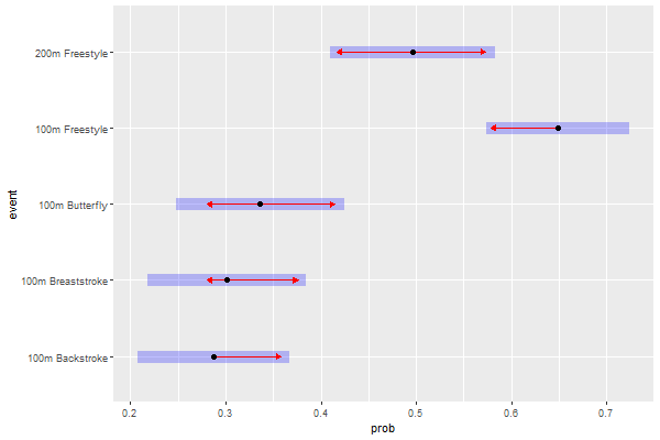
Estimated marginal probabilities by event
pairs(event.emp)
 contrast                            estimate     SE  df z.ratio p.value
 100m Backstroke - 100m Breaststroke  -0.0138 0.0531 Inf  -0.260  0.9990
 100m Backstroke - 100m Butterfly     -0.0489 0.0549 Inf  -0.889  0.9009
 100m Backstroke - 100m Freestyle     -0.3612 0.0515 Inf  -7.013  <.0001
 100m Backstroke - 200m Freestyle     -0.2089 0.0551 Inf  -3.794  0.0014
 100m Breaststroke - 100m Butterfly   -0.0351 0.0564 Inf  -0.622  0.9717
 100m Breaststroke - 100m Freestyle   -0.3474 0.0531 Inf  -6.544  <.0001
 100m Breaststroke - 200m Freestyle   -0.1951 0.0566 Inf  -3.447  0.0051
 100m Butterfly - 100m Freestyle      -0.3123 0.0545 Inf  -5.730  <.0001
 100m Butterfly - 200m Freestyle      -0.1600 0.0578 Inf  -2.767  0.0448
 100m Freestyle - 200m Freestyle       0.1523 0.0537 Inf   2.835  0.0370

Results are averaged over the levels of: gender, swimTradition, meetType
P value adjustment: tukey method for comparing a family of 5 estimates
What the pairs() function does is basically compare the estimated marginal probabilities (event.emp) of each event against the others, in pairs. There are five events, which gives 10 pairs. The p-values were already adjusted for our 10 pairwise comparisons using the Tukey method, so we can directly make a decision on which levels to group depending on the p-value of their pair. We decide to set the level of significance at $\alpha = 0.05$. Our null hypothesis here would be $H_{0}:$ “Event A and Event B equally contribute to the prediction of fasterRelay“, where Event A and B can be any two different events from the five factors of event. If the p-value for a pair is greater than our $\alpha$, we can conclude that there is not enough evidence that Event A’s and Event B’s contributions to the prediction of fasterRelay are significantly different. Conversely, if the p-value of a pair is below $\alpha$, we can reject the null hypothesis for that pair. Given an alpha of 0.05, we can reject the null hypothesis for all pairs except three: 100m Backstroke - 100m Breaststroke ($p=0.999$), 100m Backstroke - 100m Butterfly ($p=0.901$), and 100m Breaststroke - 100m Butterfly ($p=0.972$). These three events were all compared against eacher other, and all the p-values for these comparisons were very high. Therefore, along with the results previously obtained in Table 1, we can conclude with high certainty that the 100m Backstroke, 100m Breaststroke and 100m Butterfly levels of event all equally contribute to the prediction of fasterRelay and can therefore be grouped into one unique factor.
In order to stay consistent in the assessment of statistical significance throughout our analysis, we must evaluate all variables with the same $\alpha$ which we set to 0.05, so to conclude our ANOVA chi-square tests and pairwise comparison test, following that level of significance we decide to exclude gender and meetYear from our model, and to group the 100m Breaststroke and 100m Butterfly levels of event with the reference level 100m Backstroke. Our new model will therefore have 7 predictors, down from 11.
Building and assessing our new model mdlMain.R
We are first going to define our new restricted model (hence .R) following the results of the previous section:
levels(dsSwim$event)
- ‘100m Backstroke’
- ‘100m Breaststroke’
- ‘100m Butterfly’
- ‘100m Freestyle’
- ‘200m Freestyle’
tail(dsSwim$event)
- 100m Butterfly
- 200m Freestyle
- 200m Freestyle
- 200m Freestyle
- 100m Backstroke
- 100m Backstroke
Levels:
- ‘100m Backstroke’
- ‘100m Breaststroke’
- ‘100m Butterfly’
- ‘100m Freestyle’
- ‘200m Freestyle’
The first three levels are grouped into a single 100m Breast_Back_Fly level:
levels(dsSwim$event) <- c("100m Breast_Back_Fly", "100m Breast_Back_Fly", "100m Breast_Back_Fly", "100m Freestyle", "200m Freestyle")
tail(dsSwim$event)
- 100m Breast_Back_Fly
- 200m Freestyle
- 200m Freestyle
- 200m Freestyle
- 100m Breast_Back_Fly
- 100m Breast_Back_Fly
Levels:
- ‘100m Breast_Back_Fly’
- ‘100m Freestyle’
- ‘200m Freestyle’
The previous levels were successfully replaced with the new level. Let us now build our new restricted model:
mdlMain.R <- fasterRelay ~ event + ageAtMeet + swimTradition + meetType
mdlMain.Rf <- factor(fasterRelay, levels=c(0,1)) ~ event + ageAtMeet + swimTradition + meetType
We also define a second model, mdlMain.Rf, identical to the first one except for fasterRelay being converted to factor which will be needed for the random forests method in the next section.
We once again perform logistic regression on our new model:
rsltLog <- glm(mdlMain.R, data=dsSwim, family=binomial(link="logit"))
| Dependent variable: | |
| fasterRelay | |
| Constant | -2.523*** |
| (0.617) | |
| event100m Freestyle | 1.416*** |
| (0.190) | |
| event200m Freestyle | 0.799*** |
| (0.195) | |
| ageAtMeet | 0.066*** |
| (0.022) | |
| swimTradition2 | 0.689** |
| (0.287) | |
| swimTradition3 | 0.579** |
| (0.258) | |
| meetTypeworlds | -0.443*** |
| (0.167) | |
| Observations | 780 |
| Log Likelihood | -495.131 |
| Akaike Inf. Crit. | 1,004.263 |
| Note: | *p<0.1; **p<0.05; ***p<0.01 |
The logit coefficients for our new model can be seen in Table 2, and this time every coefficient is statistically significant at least at a level of 0.05. The coeffficients of our explanatory variables slightly changed, but the interpretation of their influence on fasterRelay stays the same.
Just like we did for our previous model, we are now going to assess the goodness of fit of mdlMain.R:
LRT <- -2*(rsltLog$null.deviance - rsltLog$deviance)
K <- rsltLog$df.null - rsltLog$df.residual

cat("p-value:", pchisq(LRT, df=K))
cat("\nNull deviance:", round(rsltLog$null.deviance, 1))
cat("\nDeviance:", round(rsltLog$deviance,1))
p-value: 0
Null deviance: 1069.5
Deviance: 990.3
A quick likelihood ratio test confirms that our new model still brings significant improvement in the prediction of fasterRelay, however the deviance of mdlMain.R looks pretty similar to that of mdlMain. Let us now have a look at the pseudo $R^{2}$:
# we repeat the steps to find the pseudo R²:
lnL.Log <- logLik(rsltLog)
lnL.Null <- logLik(rsltNull)
McFadden.R2 <- 1 - (lnL.Log/lnL.Null)
McFadden.R2adj <- 1 - ((lnL.Log - K)/lnL.Null)

# and the Count R²:
yprob <- predict.glm(rsltLog, type="response")
Count.R2 <- sum(obs.y == (yprob>0.5))/length(obs.y)
Count.R2adj <- (sum(obs.y == (yprob>0.5)) - maxFreq)/(length(obs.y) - maxFreq)

t(round(cbind(McFadden.R2, McFadden.R2adj, Count.R2, Count.R2adj), 3))
| McFadden.R2 | 0.074 |
|---|---|
| McFadden.R2adj | 0.063 |
| Count.R2 | 0.627 |
| Count.R2adj | 0.149 |
The pseudo $R^{2}$ ($R^{2}_{McF} = 0.074$) and the Count $R^{2}$ ($R^{2}_{Count} = 0.627$) are both almost the same as those of mdlMain, approximately 5% smaller. This means two important things: the restricted mdlMain.R model does not fit our data better than mdlMain, but these goodness of fit results also confirm that the predictors we excluded from our new model indeed did not play a significant role in predicting fasterRelay.
Before we move onto model validation, the last step in this section is to perform a quick residual analysis, which will check for heteroskedasticity in our model.
Deviance residuals analysis
Another way to look at the goodness of fit of our model is to analyse the deviance residuals of our model, which are basically the components of the (binomial) log-likelihood function but slightly modified to follow a $\chi^2$ distribution (if we sum the squares of the deviance residuals and then divide by -2, we get the log-likelihood function). Let us have a look at both the Pearson residuals (standardised raw residuals) and the deviance residuals of our model; in both graphs, the residuals are plotted against the fitted/predicted values, which are not the fitted probabilities but the values of the linear predictor $\boldsymbol{\beta}\cdot\bf{X}$ :
#png(file=paste0(dirPlot, "residuals_vs_fitted.png"), height=600, width=900)

options(repr.plot.height=8, repr.plot.width=10)
par(mfrow = c(1, 2))

# Pearson residuals:
plot(predict(rsltLog), resid(rsltLog, type="pearson"), col=c("blue", "brown")[1+dsSwim$fasterRelay], lwd=3,  main="Pearson residuals vs Fitted", xlab="Predicted values", ylab="Pearson residuals")
abline(h=0, lty=2, col='grey')
lines(lowess(predict(rsltLog), resid(rsltLog, type="pearson")), col='red', lwd=2)

# Deviance residuals:
resid.dev <- resid(rsltLog)
plot(predict(rsltLog), resid.dev, col=c("blue", "brown")[1+dsSwim$fasterRelay], lwd=3, main="Deviance residuals vs Fitted", xlab="Predicted values", ylab="Deviance residuals")
abline(h=0, lty=2, col='grey')
lines(lowess(predict(rsltLog), resid.dev), col='red', lwd=2)

#dev.off()
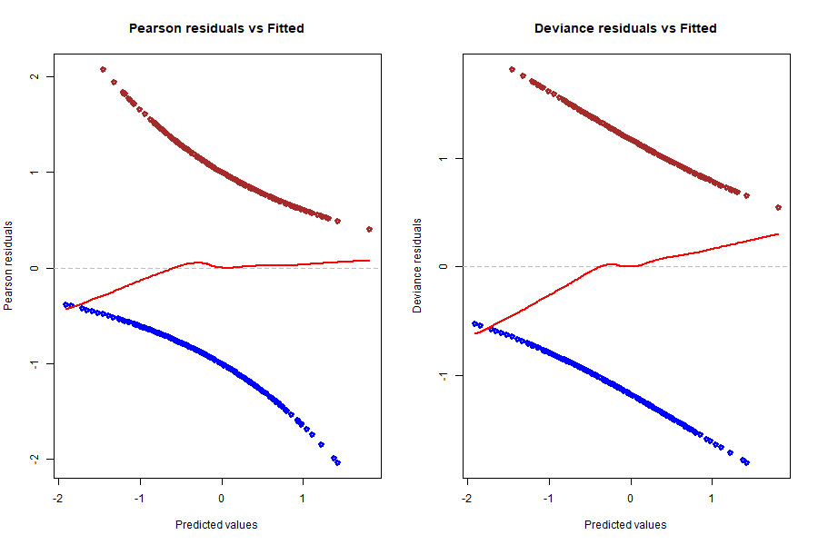
A LOWESS line and a y=0 line were plotted in both graphs for easier analysis. We ideally want both LOWESS lines to be as flat and close to 0 as possible, which would mean that residuals average around 0 whatever the predicted value and there is no tendency in these residuals. We can say that the red line in the Pearson residuals graph is pretty much flat, except for the left tail leaning a little bit into the negatives, but it looks very good overall. Now, looking at the deviance residuals graph, we clearly spot a small positive slope across the entire range of predicted values. This means that there is some tendency in the deviance residuals, or that they increase on average with the predicted value. The underlying reason could be that there is a relationship between these residuals and one or more of our explanatory variables, and to find out we need to dive deeper into the behaviour of the residuals compared to each variable. But before that, let us have another look at the results above by plotting them in a different fashion:
#png(file=paste0(dirPlot, "binned_residuals.png"), height=600, width=1000)
options(repr.plot.width=10, repr.plot.width=16)
par(mfrow = c(1, 2))

binnedplot(x=predict(rsltLog), y=resid(rsltLog, type="pearson"), nclass=100, main ="Binned Pearson residuals vs fitted")
binnedplot(x=predict(rsltLog), y=resid(rsltLog, type="deviance"), nclass=100, main ="Binned deviance residuals vs fitted")
#dev.off()
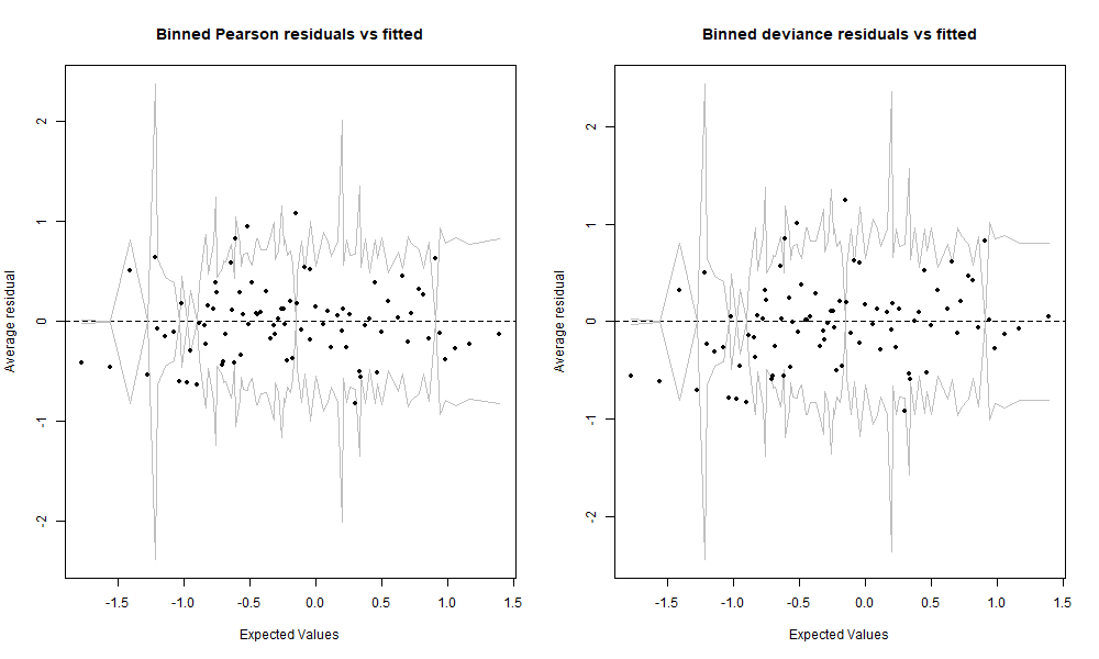
We binned or gouped the residuals by averaging them over a certain number of predicted values. The data in these two graphs is exactly the same as in the two previous graphs, and the axes as well except that the y axis is now the average residual. We set nclass=100 which means that there are approximately 100 bins on these graphs, and given that we have 780 observations, that makes about 8 residuals averaged per bin. This view gives us another perspective and lets us decide whether we really see any tendency that would raise concern. But given the relatively small size of our data set, both of these binned residuals graphs are looking very good. For the sake of curiosity, we are still going to further investigate the deviance residuals.
#png(file=paste0(dirPlot, "residuals_vs_age.png"), height=600, width=600)

options(repr.plot.width=8, repr.plot.width=8)
plot(dsSwim$ageAtMeet, resid(rsltLog, type="deviance"), col=c("blue", "brown")[1+dsSwim$fasterRelay], main="Deviance residuals vs ageAtMeet", ylab="Deviance residuals")
abline(h=0, lty=2, col='grey')
lines(lowess(dsSwim$ageAtMeet, resid(rsltLog, type="deviance")), col='red', lwd=2)

#dev.off()
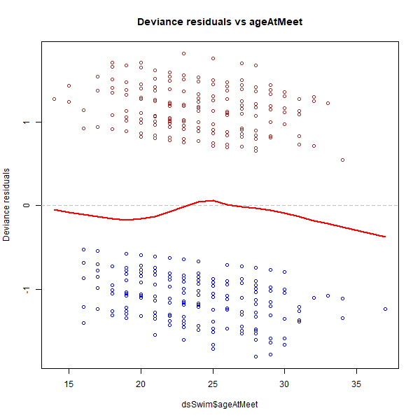
We see that there is no significant trend in the graph above. We shall not forget that at both ends of the range, i.e. youngest and oldest ages, we have very few data points compared to the rest of age values closer to the centre of the range, which means that the red LOWESS line dipping into the negatives at the right end of the range is less significant. Therefore, we can consider the line as almost flat and around 0. Now let us move onto the other variables, which are all categorised variables, so we are going to need another type of graph (box plot) to visualise the behaviour of the residuals against them:
#png(file=paste0(dirPlot, "residuals_vs_event-trad.png"), height=600, width=1000)

# Resids vs event
options(repr.plot.height=8, repr.plot.width=14)
par(mfrow = c(1, 2))
boxplot(resid(rsltLog, type="deviance") ~ dsSwim$event, main="Deviance residuals vs event", xlab="Event", ylab="Residual")
stripchart(resid(rsltLog, type="deviance") ~ dsSwim$event, method="jitter", vertical=TRUE, add=TRUE)
abline(h=0, lty=2, col='grey')

# Resids vs swimTradition
boxplot(resid(rsltLog, type="deviance") ~ dsSwim$swimTradition, main="Deviance residuals vs swimTradition", xlab="swimTradition", ylab="Residual")
stripchart(resid(rsltLog, type="deviance") ~ dsSwim$swimTradition, method="jitter", vertical=TRUE, add=TRUE)
abline(h=0, lty=2, col='grey')

#dev.off()

#png(file=paste0(dirPlot, "residuals_vs_meet.png"), height=600, width=500)

# Resids vs meetType
options(repr.plot.height=8, repr.plot.width=14)
boxplot(resid(rsltLog, type="deviance") ~ dsSwim$meetType, main="Deviance residuals vs meetType", xlab="meetType", ylab="Residual")
stripchart(resid(rsltLog, type="deviance") ~ dsSwim$meetType, method="jitter", vertical=TRUE, add=TRUE)
abline(h=0, lty=2, col='grey')


#dev.off()
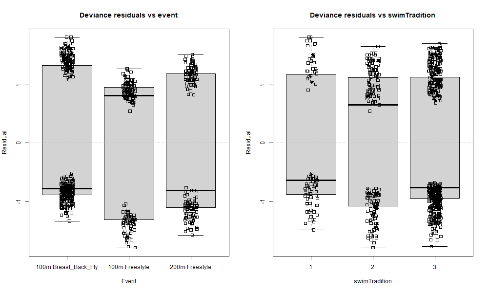
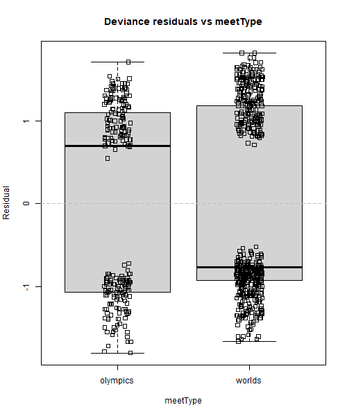
All data points were left in these box plots to better visualise where the residuals are concentrated. The solid line inside the box is the median, and it sometimes is above zero for some boxes, and below zero for the others, but what matters more is its position compared to the data points. An example of almost perfect distribution of residuals around zero is the 200m Freestyle box in the Deviance residuals vs event graph. The median is below zero, but there is only one negative residual right above it: what this means is that there are basically as many positive than negative residuals, so our model does not systematically under- or over-predict for this category. In contrast, things are looking a little bit different over in the 100m Breast_Back_Fly box: the median is negative and quite buried inside the cluster of negative residuals where it is much darker (= the biggest density of points), and this means that there are many more negative than positive residuals for this category. In other words, our model systematically over-predicts (since more residuals are negative) fasterRelay outcomes when event is 100m Breast_Back_Fly. A similar result can be observed for 100m Freestyle but the other way around: our model seems to systematically slightly under-predict fasterRelay outcomes for that category of event. We could argue that this is also happening for worlds in Deviance residuals vs meetType and the strongest swimming tradition level 3 in Deviance residuals vs swimTradition, but to a lesser extent as well.
After a quick check for interaction terms between event and other variables, the deviance residual trend did not change a bit, which unsurprisingly means that the underlying cause was not a subtle iteraction between two of the explanatory variables. However, we recall that we grouped 3 levels of event into one that now has over twice the number of observations as the two remaining levels, 100m Freestyle and 200m Freestyle. Next, we add weights to our logistic model, following that the event value of an observation is 100m Freestyle or 200m Freestyle (weight = 2) or 100m Breast_Back_Fly (weight = 1) and visualise the results:
#png(file=paste0(dirPlot, "residuals_vs_event_weighted.png"), height=500, width=500)

# Logistic regression with weights:
rsltLog.weighted <- glm(mdlMain.R, data=dsSwim, family=binomial(link="logit"), weights=ifelse(dsSwim$event=="100m Breast_Back_Fly", 1, 2))

# Residuals vs event levels
options(repr.plot.width=8)
boxplot(resid(rsltLog.weighted, type="deviance") ~ dsSwim$event, main="Deviance residuals vs event, with weights", xlab="Event", ylab="Residual")
stripchart(resid(rsltLog.weighted, type="deviance") ~ dsSwim$event, method="jitter", vertical=TRUE, add=TRUE)
abline(h=0, lty=2, col='grey')

#dev.off()

#png(file=paste0(dirPlot, "residuals_vs_fitted_weighted.png"), height=600, width=1000)

# Residuals vs predicted values
options(repr.plot.width=11)
par(mfrow = c(1, 2))

plot(predict(rsltLog.weighted), resid(rsltLog.weighted, type="pearson"), col=c("orange", "purple", "dark green")[as.numeric(dsSwim$event)], lwd=3, main="Deviance residuals vs Fitted, with weights", xlab="Predicted values", ylab="Deviance residuals")
abline(h=0, lty=2, col='grey')
lines(lowess(predict(rsltLog.weighted), resid(rsltLog.weighted, type="pearson")), col='red', lwd=2)

plot(predict(rsltLog), resid.dev, col=c("blue", "brown")[1+dsSwim$fasterRelay], lwd=3, main="Deviance residuals vs Fitted, NO weights", xlab="Predicted values", ylab="Deviance residuals")
abline(h=0, lty=2, col='grey')
lines(lowess(predict(rsltLog), resid.dev), col='red', lwd=2)

#dev.off()
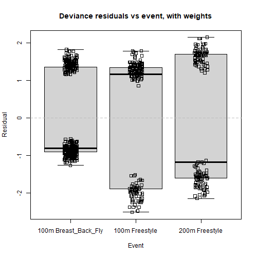
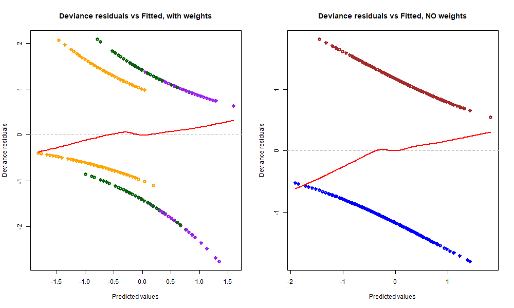
We barely notice any change in the first box plot graph, however we notice that the red LOWESS line in Deviance residuals vs Fitted, with weights has become a little bit flatter than before (see graph to the right), especially the left tail. This is because we added more weight to observations belonging to the 100m Freestyle or 200m Freestyle categories. Indeed, we saw that the model systematically over-predicts with the 100m Breast_Back_Fly category, and after adding colours it is now clear that these values coloured in orange are distributed more to the left side of the range, which is partly responsible for the left tail of the red line dipping into the negatives. In contrast, the predicted values for 200m Freestyle coloured in dark green and 100m Freestyle coloured in purple spread further right, which is one underlying cause of the right tail of the red line going slightly up.
After adding weights to our model and colouring the residuals based on the event category of the predicted value, the reason behind the slight tendency of deviance residuals against predicted values is now clear to us: during the EDA, we saw that the proportions of fasterRelay outcomes (0/1) were different for these 3 different groups (e.g. 100m Freestyle had a much bigger percentage of 1 outcomes), and we split the character variable into 3 factors corresponding to these 3 groups being fully aware of those discrepancies – something that adding weights to the model cannot solve. Therefore, these three levels were not sampled randomly with regards to their fasterRelay outcome proportions, and the positive tendency between deviance residuals and predicted values reflects that difference in proportions. Of course this might not be the one and only reason behind that tendency, but the takeaway here is that we shouldn’t be worried about the red line not being perfectly flat because the cause behind it is now known to us and is not problematic (cannot & does not need to be fixed).
Section 2: Model validation
K-fold cross-validation
This section focuses on how well the predictive power of our model generalises to new data, or data that the model was not trained on. We also want to repeat this process several times so that we get an idea of how consistent our model is, how it performs on average, and so that our perception of its predictive power is not wronged by potential over-fitting. We are free to choose the proportions of our training and test sets, however when deciding on that we also need to take into account the number of folds we want to use and the size ofdsSwim. By randomly sampling the observations of dsSwim without replacement, we shuffle the rows, and then cut the data into K folds. Given that our data set does not contain a large number of observations, we will choose a smaller K of 5. This in turn leads us to choose a 80% training/ 20% test ratio, which would mean setting one fold as the test set and the remaining data as the training set. This seems to be the best choice all things considered, since we do not have enough data to break it down into more folds, or to use 2 folds for the test set (which would leave only 3 folds for training, and that makes up too few observations for proper training).
nFolds <- 5  # folds for cross validation

nTrees <- 500  # trees for gradient boosting
nbTerms <- length(labels(terms(mdlMain.R)))
nbVar <- round(sqrt(nbTerms)) # number of variables per split for random forests

# Randomly assigning a fold-id to each observation
iFolds <- cut(sample(1:nrow(dsSwim)), nFolds, labels = FALSE)
table(iFolds)

# Make empty list to store the results. The list will be
# used to capture predicted and observed values of all
# model predictions
rsltAll <- list()
iFolds
  1   2   3   4   5
156 156 156 156 156
Each fold contains 156 observations. We are now going to loop over each fold and use it as a test set, while the four other fold serve as a training set for the four prediction methods:
for (fold in 1:nFolds) {
   # Issue message about current fold
   cat("Current fold : ", fold, "\n")

   dsSwim.Train <- dsSwim[iFolds != fold,]
   dsSwim.Test  <- dsSwim[iFolds == fold,]

   # Training the models
   rsltLog  <- glm(mdlMain.R, data=dsSwim.Train, family=binomial(link="logit"))
   rsltTree <- rpart(mdlMain.R, data=dsSwim.Train, method="class", parms=list(split="information"))
   rsltFrst <- randomForest(mdlMain.Rf, data=dsSwim.Train, ntree=200, mtry=nbVar)
   rsltGbm  <- gbm(mdlMain.R, data=dsSwim.Train,
                   distribution="bernoulli", n.trees=nTrees,
                   interaction.depth=2, shrinkage=0.01,
                   bag.fraction=0.5, n.minobsinnode=10)

   obs.Test  <- dsSwim.Test$fasterRelay

   # Predictions for test set using trained models
   probLog.Test   <- predict(rsltLog, dsSwim.Test, type=c("response"))
   probTree.Test  <- predict(rsltTree, dsSwim.Test, type="prob")[,2]
   probFrst.Test  <- predict(rsltFrst, dsSwim.Test, type="prob")[,2]
   probGbm.Test   <- predict(rsltGbm, dsSwim.Test, type="response", n.trees=nTrees)

   rsltAll$Obs[[fold]] <- obs.Test  # we also stock the observed values
   rsltAll$Log$predictions[[fold]]  <- unname(probLog.Test)
   rsltAll$Tree$predictions[[fold]] <- unname(probTree.Test)
   rsltAll$Frst$predictions[[fold]] <- unname(probFrst.Test)
   rsltAll$Gbm$predictions[[fold]] <- unname(probGbm.Test)
}
Current fold :  1
Current fold :  2
Current fold :  3
Current fold :  4
Current fold :  5
Let us have a quick look at what the results look like:
str(rsltAll)
List of 5
 $ Obs :List of 5
  ..$ : int [1:156] 0 0 1 0 0 1 1 0 0 0 ...
  ..$ : int [1:156] 1 1 1 1 1 1 1 1 0 1 ...
  ..$ : int [1:156] 1 1 0 1 1 0 1 1 0 1 ...
  ..$ : int [1:156] 0 0 1 0 0 1 0 0 0 0 ...
  ..$ : int [1:156] 0 0 0 0 0 0 0 0 1 0 ...
 $ Log :List of 1
  ..$ predictions:List of 5
  .. ..$ : num [1:156] 0.395 0.608 0.429 0.272 0.429 ...
  .. ..$ : num [1:156] 0.44 0.631 0.578 0.54 0.459 ...
  .. ..$ : num [1:156] 0.676 0.723 0.461 0.382 0.367 ...
  .. ..$ : num [1:156] 0.447 0.244 0.454 0.547 0.309 ...
  .. ..$ : num [1:156] 0.637 0.622 0.593 0.507 0.369 ...
 $ Tree:List of 1
  ..$ predictions:List of 5
  .. ..$ : num [1:156] 0.366 0.622 0.622 0.366 0.622 ...
  .. ..$ : num [1:156] 0.413 0.667 0.413 0.413 0.655 ...
  .. ..$ : num [1:156] 0.651 0.651 0.651 0.578 0.322 ...
  .. ..$ : num [1:156] 0.631 0.326 0.54 0.54 0.296 ...
  .. ..$ : num [1:156] 0.714 0.714 0.714 0.714 0.375 ...
 $ Frst:List of 1
  ..$ predictions:List of 5
  .. ..$ : num [1:156] 0.255 0.67 0.585 0.08 0.585 0.665 0.94 0.22 0 0 ...
  .. ..$ : num [1:156] 0.225 0.975 0.265 0.48 0.755 0.4 0.86 0 0.26 0.03 ...
  .. ..$ : num [1:156] 0.94 0.875 0.49 0.645 0.065 0.325 0.405 0.325 0.005 0.9 ...
  .. ..$ : num [1:156] 0.365 0.075 0.56 0.635 0.065 0.02 0.105 0 0.065 0.04 ...
  .. ..$ : num [1:156] 0.925 0.795 0.95 0.51 0.795 0.335 0.42 0.26 0 0.105 ...
 $ Gbm :List of 1
  ..$ predictions:List of 5
  .. ..$ : num [1:156] 0.407 0.681 0.453 0.276 0.453 ...
  .. ..$ : num [1:156] 0.405 0.695 0.514 0.503 0.504 ...
  .. ..$ : num [1:156] 0.689 0.706 0.472 0.427 0.348 ...
  .. ..$ : num [1:156] 0.483 0.255 0.468 0.544 0.393 ...
  .. ..$ : num [1:156] 0.661 0.64 0.672 0.548 0.497 ...
rsltAll is a list of 5 elements, the first being the observed values of fasterRelay for each fold, and the four others being the predicted probabilities for each method, for each fold. The next step is to extract the predicted and observed values and to summarise the various aspects of the prediction performance of the four classifier methods:
# assigning predicted and observed values to variables:
obs.y  <- rsltAll$Obs
probLog  <- rsltAll$Log$predictions
probTree <- rsltAll$Tree$predictions
probFrst <- rsltAll$Frst$predictions
probGbm  <- rsltAll$Gbm$predictions

# prediction and performance for ROC:
pred.Log  <- prediction(probLog, obs.y)
perf.Log  <- performance(pred.Log, "tpr", "fpr")

pred.Tree <- prediction(probTree, obs.y)
perf.Tree <- performance(pred.Tree, "tpr", "fpr")

pred.Frst <- prediction(probFrst, obs.y)
perf.Frst <- performance(pred.Frst, "tpr", "fpr")

pred.Gbm <- prediction(probGbm, obs.y)
perf.Gbm <- performance(pred.Gbm, "tpr", "fpr")
#png(file=paste0(dirPlot, "ROC_crossvalid.png"), height=700, width=700)

# finally we plot the ROC curves:
options(repr.plot.height=11)

plot(perf.Log,  lty = 2, lwd = 1, col = "red", main="ROC curves for 5-fold cross-validation")
plot(perf.Tree, lty = 2, lwd = 1, col = "darkgreen", add = TRUE)
plot(perf.Frst, lty = 2, lwd = 1, col = "purple", add = TRUE)
plot(perf.Gbm,  lty = 2, lwd = 1, col = "blue", add = TRUE)

# we also add the averages of the folds:
plot(perf.Log,  avg= "threshold", lty = 1, lwd = 3, col = "red", add = TRUE)
plot(perf.Tree, avg= "threshold", lty = 1, lwd = 3, col = "darkgreen", add = TRUE)
plot(perf.Frst, avg= "threshold", lty = 1, lwd = 3, col = "purple", add = TRUE)
plot(perf.Gbm,  avg= "threshold", lty = 1, lwd = 3, col = "blue", add = TRUE)

abline(a = 0, b = 1, lty = 3, lwd = 1.5)
legend(0.6,0.35, c("Logit regression",
                  "Classification tree",
                  "Random forest",
                  "Gradient boosting"),
       col=c("red","darkgreen","purple","blue"),
       lwd=3)

#dev.off()
The receiver operating characteristic curve is obtained by plotting the true positive rate against the false positive rate. We can already get a quick idea of which classifier performed the best, but a much more simple way to look at it is to retrieve the area under the curve (AUC):
auc.Log  <- do.call(rbind,performance(pred.Log, "auc")@y.values)
auc.Tree <- do.call(rbind,performance(pred.Tree,"auc")@y.values)
auc.Frst <- do.call(rbind,performance(pred.Frst,"auc")@y.values)
auc.Gbm  <- do.call(rbind,performance(pred.Gbm, "auc")@y.values)

auc.All <- data.frame(auc.Log, auc.Tree, auc.Frst, auc.Gbm)
round(auc.All, 3)

# stargazer(auc.All, align=TRUE, type="html", omit.summary.stat = c("n", "median", "p25", "p75"))
| auc.Log | auc.Tree | auc.Frst | auc.Gbm |
|---|---|---|---|
| <dbl> | <dbl> | <dbl> | <dbl> |
| 0.679 | 0.626 | 0.676 | 0.663 |
| 0.687 | 0.610 | 0.604 | 0.686 |
| 0.663 | 0.608 | 0.651 | 0.688 |
| 0.665 | 0.606 | 0.638 | 0.653 |
| 0.687 | 0.601 | 0.597 | 0.638 |
| Statistic | Mean | St. Dev. | Min | Max |
| auc.Log | 0.676 | 0.012 | 0.663 | 0.687 |
| auc.Tree | 0.610 | 0.009 | 0.601 | 0.626 |
| auc.Frst | 0.633 | 0.033 | 0.597 | 0.676 |
| auc.Gbm | 0.666 | 0.021 | 0.638 | 0.688 |
auc.All statistical summaryIt now becomes obvious that the best performing classifier out of our 5-fold cross-validation is logistic regression ($AUC=0.676$), closely followed by gradient boosting ($AUC=0.666$), then by random forests ($AUC=0.633$) and finally simple classification trees ($AUC=0.610$). The classifier with the most stable and consistent predictions is classification trees ($sd=0.009$) closely followed by logistic regression ($sd=0.012$). In sum, logistic regression both performed the best on average and almost had the smallest AUC standard deviation, which means it has the best and most stable predictive performance among the four classifiers. On the ROC graph we plotted a thin dotted $y=x$ line which has an $AUC$ of 0.5: this line serves as a visual and numerical ($AUC$) reference for the predictive power of our model. If our model randomly guessed the outcome of fasterRelay, its $AUC$ would be around 0.5. The $AUC$ value obtained for logistic regression is actually not uncommon at all and can be considered acceptable, though definitely not outstanding. This once again shows that significant improvements could be made to our model to enhance our ability to predict fasterRelay, such as gathering more data (before 2015) and especially more relevant data (additional explanatory variables). Ultimately, considering that we did not carefully choose the data we collected along with solo and relay TIW, this predictive performance can definitely be considered passable enough.
$$ \sim $$
Conclusion
This project set out to find out whether elite swimmers tend to swim faster in relay events than in individual events at major swimming meets. In order to establish meaningful comparisons between these two types of races, the reaction time was subtracted from the final swim time to obtain a new variable which we baptised “time in water” (TIW): that way, individual and relay leg performances could be fairly compared with each other. We made the assumption that the resulting binary variable, which indicated whether a swimmer’s relay leg TIW was faster than their individual TIW for the same event, measured the motivation of elite swimmers to swim faster for their country’s team at major meets.
This 3rd part of the project focused on statistical modelling, where the focus was on better understanding the suspected effects discovered in our EDA of swimming event, swimmer age, national swimming tradition, type of major meet, swimmer gender, and year of the meet on faster relay TIW. These explanatory variables were not chosen on purpose, since the data for these variables was simply scraped along with individual and relay times, assuming that some kind of relationship could be established between them and faster relay TIW. For that reason, we did not really expect a model consisting of these variables to have an outstanding predictive power. All statistical tests and decisions to include or exclude variables in this part of the study were made at a 0.05 significance level, for consistency.
A first model with all the explanatory variables named above was trained on our data with logistic regression, and the goodness of fit of that model was found to be acceptable though fairly weak. It came out that the age of a swimmer at the meet and the year of the meet both had non-significant $\beta$ coefficients, which was corroborated by two $\chi^{2}$ individual effect tests with non-significant results, thus we excluded these two variables from the model. The 100m Breaststroke and 100m Butterfly factors were found to not have significantly different predictive capabilties from the 100m Backstroke factor, thus we grouped the three as a single factor. Analysing the estimated marginal probabilities not only helped in making that decision, but also revealed that the group of those three events, the 200m Freestyle, and the 100m Freestyle events all had significantly different predictive capabilities, in increasing order. We can therefore consider these three categories of swimmers as coming from different populations in terms of motivation to swim faster for their country’s team (though this conclusion has some limitations). No multicollinearity issues were found.
A second, simpler model with all the modifications described above was once again trained with logistic regression, and had a similar goodness of fit to the first model. A residual analysis was performed on this second model, and no significant concern was raised regarding the behaviour of deviance residuals: only a slight positive trend against predicted values was spotted, and the main cause was identified as being the differences in dependent variable outcomes between the three groups of events (100m Back/Breast/Fly, 200m Freestyle, 100m Freestyle) described in the previous paragraph.
Lastly, 5-fold cross-validation was performed on the second model with an 80% training / 20% holdout ratio, and logistic regression came out as the best classifier among four methods (classification trees, random forests, gradient boosting), with a passable enough ROC-AUC.
Discussion
As we said previously, there are limitations in the interpretations we made of our results related to how we performed data sampling. The small size of our data set is without a doubt one of the reasons behind the relatively disappointing goodness of fit of our model, and obtaining data from before 2015 could certainly have yielded improved results. However, given that the data for our explanatory variables was not picked following specific criteria or assumptions, the performance of our model can be considered acceptable.
Considering 100m Back/Breast/Fly, 200m Freestyle and 100m Freestyle elite swimmers as three different populations of swimmers could actually be incorrect if formulated this way, since some swimmers do swim two of these events and the corresponding relay legs (which we did not take into accountà, and would then belong to two different populations. We could instead infer that the nature of the event itself influences the difference in solo and relay TIW, and that there would be three populations of “event motivations” instead of swimmers, which is a more abstract way of looking at it. The underlying cause behind these three populations could be the nature of the relay event itself. Yannick Agnel, a former elite French freestyler, revealed that he prepared together with his 3 teammates for an entire year specifically for the 2012 London Olympics 100m Freestyle relay where they finally got the best of their American rivals. This could hint at the importance of preparing a major relay event together with the entire team to boost their motivation and increase the odds that the swimmers surpass themselves during the relay rather than in the solo event, having invested so much work and hope into preparing for that relay. In contrast, it wouldn’t be surprising if medley relay swimmers often do not train together due to the heterogenous nature of this event: two swimmers specialising in 100m Breaststroke and 100m Butterfly could be less likely to often train together, or share a similar mindset, than two 100m or 200m Freestyle swimmers. While formulating all these assumptions, the need for more data, and especially more specific data arises.
In further research, one could consult with swimming professionals to discuss potentially relevant variables to further explain the matters discussed above, such as: the mobility of the swimmer, i.e. does the swimmer often train abroad and therefore much less often with their home team? nowadays, more and more young swimmers train outside of their home country; coaching practices especially when it comes to relays; personal training habits, i.e. does the swimmer mostly train on their own with their coach, or together with other swimmers (of any nationality) – we could think that training alone reduces the probability of being more motivated by relays than solo races; etc.
Bonus: complexity control for classification trees
classificationPerf <- function(f, y, tau = 0.5) {
   # f: classification probability
   # y: observed value fasterRelay
   # tau: threshold

   # Converting classification probabilities to class predictions based on threshold tau
   f <- as.numeric(f > tau)
   # Defining observed and predicted classification variables as factors. Data type factor to prevent errors when predicted classes are all of one kind
   y <- factor(y, levels = c(0,1))
   f <- factor(f, levels = c(0,1))

   # Classification table
   tbl <- table(Predicted = f, Observed = y)
   # Identifying classifications true/false negatives/positives
   TN <- tbl[1,1]
   FN <- tbl[1,2]
   FP <- tbl[2,1]
   TP <- tbl[2,2]

   # Measuring performance
   perf <- c(
      Accuracy    = (TP+TN)/sum(tbl),
      Sensitivity = TP/(TP + FN),
      Specificity = TN/(FP + TN),
      Precision   = TP/(FP + TP)
   )

   return(perf)
}
rsltAll  <- data.frame()

# Percentage training set and number of trials
pctTrain <- 0.70
nTrials  <- 10

# Loop over the settings of the control parameter
for (k in seq(5, 150, 5)) {
   cat("Minimum bucket size :", k, "\n")

   # Start loop over the trials
   for (i in 1:nTrials) {
      # 1: Randomly select pctTrain rows of dsBank for the
      #    training set. The remainder defines the test set
      nTrain   <- ceiling(pctTrain*nrow(dsSwim))
      obsTrain <- sample(1:nrow(dsSwim), nTrain)

      dsSwim.Train <- dsSwim[obsTrain,]
      dsSwim.Test  <- dsSwim[-obsTrain,]

      # 2: Train the models on the training set
      rsltTree.Train <-
         rpart(mdlMain.R, data=dsSwim.Train, method="class",
               parms=list(split="information"),
               control=rpart.control(minbucket=k))

      # 3: Find target values for the training set and
      #    the test set
      obs.y.Train <- dsSwim.Train$fasterRelay
      obs.y.Test  <- dsSwim.Test$fasterRelay

      # 4: Find predicted class probabilities for the
      #    training set and the test set
      probTree.Train  <-
         predict(rsltTree.Train, dsSwim.Train,
                 type=c("prob"))[,2]
      probTree.Test   <-
         predict(rsltTree.Train, dsSwim.Test,
                 type=c("prob"))[,2]

      # 5: Collect results
      rsltAll <-
         rbind(rsltAll,
               data.frame(k, i, sample="Test", t(classificationPerf(probTree.Test, obs.y.Test, 0.5))),
               data.frame(k, i, sample="Train",t(classificationPerf(probTree.Train, obs.y.Train, 0.5)))
         )
   }
}
Minimum bucket size : 5
Minimum bucket size : 10
Minimum bucket size : 15
Minimum bucket size : 20
Minimum bucket size : 25
Minimum bucket size : 30
Minimum bucket size : 35
Minimum bucket size : 40
Minimum bucket size : 45
Minimum bucket size : 50
Minimum bucket size : 55
Minimum bucket size : 60
Minimum bucket size : 65
Minimum bucket size : 70
Minimum bucket size : 75
Minimum bucket size : 80
Minimum bucket size : 85
Minimum bucket size : 90
Minimum bucket size : 95
Minimum bucket size : 100
Minimum bucket size : 105
Minimum bucket size : 110
Minimum bucket size : 115
Minimum bucket size : 120
Minimum bucket size : 125
Minimum bucket size : 130
Minimum bucket size : 135
Minimum bucket size : 140
Minimum bucket size : 145
Minimum bucket size : 150
head(rsltAll, 10)

# Summarize the classification performance for each
# selected minimum bucket size
rsltMean <-
   ddply(rsltAll, .(k, sample), summarise,
         Accuracy    = mean(Accuracy),
         Sensitivity = mean(Sensitivity),
         Specificity = mean(Specificity),
         Precision   = mean(Precision)
)
| k | i | sample | Accuracy | Sensitivity | Specificity | Precision | |
|---|---|---|---|---|---|---|---|
| <dbl> | <int> | <chr> | <dbl> | <dbl> | <dbl> | <dbl> | |
| 1 | 5 | 1 | Test | 0.6111111 | 0.5471698 | 0.6640625 | 0.5742574 |
| 2 | 5 | 1 | Train | 0.6776557 | 0.6016949 | 0.7354839 | 0.6339286 |
| 3 | 5 | 2 | Test | 0.6068376 | 0.4747475 | 0.7037037 | 0.5402299 |
| 4 | 5 | 2 | Train | 0.6831502 | 0.5802469 | 0.7656766 | 0.6650943 |
| 5 | 5 | 3 | Test | 0.6068376 | 0.4056604 | 0.7734375 | 0.5972222 |
| 6 | 5 | 3 | Train | 0.6739927 | 0.5169492 | 0.7935484 | 0.6559140 |
| 7 | 5 | 4 | Test | 0.6068376 | 0.3146067 | 0.7862069 | 0.4745763 |
| 8 | 5 | 4 | Train | 0.6611722 | 0.4822134 | 0.8156997 | 0.6931818 |
| 9 | 5 | 5 | Test | 0.5726496 | 0.3428571 | 0.7596899 | 0.5373134 |
| 10 | 5 | 5 | Train | 0.6923077 | 0.5738397 | 0.7831715 | 0.6699507 |
#png(file=paste0(dirPlot, "trees_control-1.png"), height=500, width=1000)
options(repr.plot.height=6)

plot1 <- ggplot(rsltMean, aes(x=k, y = Accuracy, linetype=sample)) +
   geom_line() +
   ggtitle("Accuracy") + xlab("Minimum bucket size") +
   theme(axis.title = element_text(size=rel(1.15)),
         axis.text  = element_text(size=rel(1.15)),
         plot.title = element_text(hjust = 0.5))
#ggsave(paste0(dirRslt, "Tutorial08MinbuckAccuracy.pdf"), width = 8, height = 6)

plot2 <- ggplot(rsltMean, aes(x=k, y = Sensitivity, linetype=sample)) +
   geom_line() +
   ggtitle("Sensitivity") + xlab("Minimum bucket size") +
   theme(axis.title = element_text(size=rel(1.15)),
         axis.text  = element_text(size=rel(1.15)),
         plot.title = element_text(hjust = 0.5))
#ggsave(paste0(dirRslt, "Tutorial08MinbuckSensitivity.pdf"), width = 8, height = 6)

grid.arrange(plot1, plot2, ncol=2)
#dev.off()

#png(file=paste0(dirPlot, "trees_control-2.png"), height=500, width=1000)

plot3 <- ggplot(rsltMean, aes(x=k, y = Specificity, linetype=sample)) +
   geom_line()+
   ggtitle("Specificity") + xlab("Minimum bucket size") +
   theme(axis.title = element_text(size=rel(1.15)),
         axis.text  = element_text(size=rel(1.15)),
         plot.title = element_text(hjust = 0.5))
#ggsave(paste0(dirRslt, "Tutorial08MinbuckSpecificity.pdf"), width = 8, height = 6)

plot4 <- ggplot(rsltMean, aes(x=k, y = Precision, linetype=sample)) +
   geom_line()+
   ggtitle("Precision") + xlab("Minimum bucket size") +
   theme(axis.title = element_text(size=rel(1.15)),
         axis.text  = element_text(size=rel(1.15)),
         plot.title = element_text(hjust = 0.5))
#ggsave(paste0(dirRslt, "Tutorial08MinbuckPrecision.pdf"), width = 8, height = 6)

grid.arrange(plot3, plot4, ncol=2)
#dev.off()
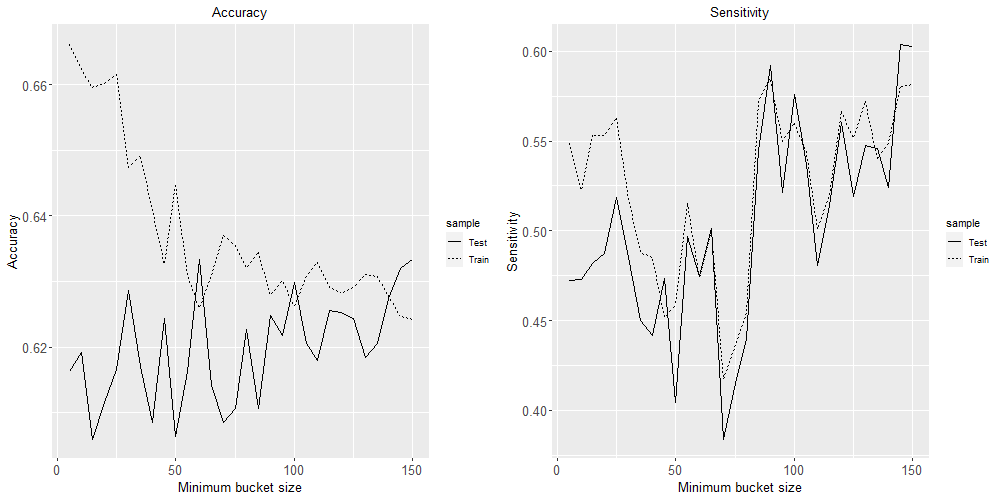
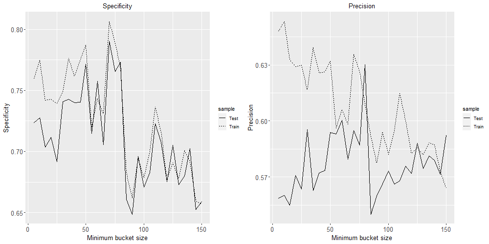
Based on these four plots, a minimum bucket size of 60 seems like the best choice to minimise over-fitting while maximising these four classification performance metrics.
Leave a Reply